Introduction
Dashboards in Dynamics 365 are more than just fancy visuals—they’re decision-making powerhouses. However, if not built thoughtfully, they can quickly become cluttered, confusing, or even misleading.
In this blog post, you’ll learn how to build better dashboards in Dynamics 365, explore common mistakes to avoid, and discover best practices that bring real clarity to your data. If you’ve ever felt overwhelmed by charts that say too much—or not enough—you’re in the right place.
Why Dashboards Matter in Dynamics 365
Dashboards in Dynamics 365 provide real-time insights, streamline decision-making, and help teams stay aligned. When set up correctly, they:
- Provide visibility across departments
- Monitor KPIs and business goals
- Help identify trends and take quick action
- Improve productivity and accountability
But not all dashboards deliver these benefits out of the box. That’s why you need a strategic approach.
Key Tips for Building Better Dashboards
Let’s explore a few proven tips to elevate the usefulness and usability of your dashboards.
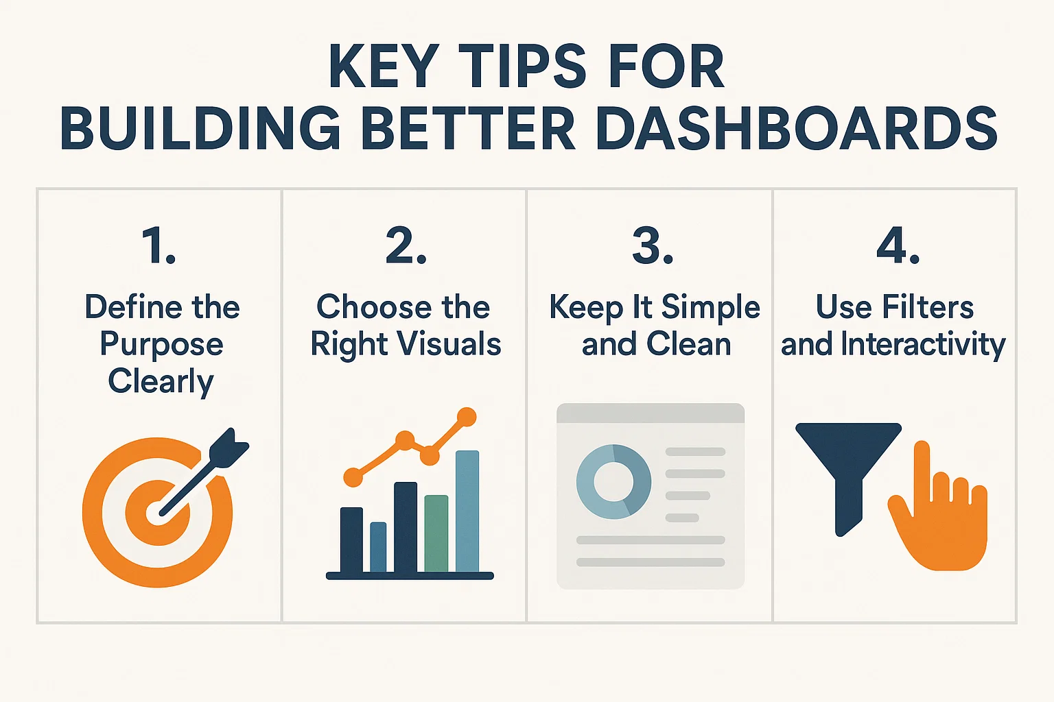
1. Define the Purpose Clearly
Before you even create a chart, ask yourself:
- Who will use this dashboard?
- What decisions should it support?
- What’s the business goal behind this?
Tailoring dashboards to specific user roles increases relevance and usability.
2. Choose the Right Visuals
Use visuals based on the type of data and user needs:
| Data Type | Best Visual | Why It Works |
|---|---|---|
| Comparisons | Bar or Column Chart | Easy to scan across categories |
| Trends Over Time | Line Chart | Shows progress and fluctuations |
| Proportions | Pie or Doughnut Chart | Good for quick ratio overviews |
| Summary Metrics | KPIs or Tiles | Clear focus on performance numbers |
Choosing the wrong chart type can lead to misinterpretation, so always match the visual to the insight you’re trying to convey.
3. Keep It Simple and Clean
While it’s tempting to add multiple charts, less is often more. A clean layout helps users focus. Aim for:
- No more than 6 components per dashboard
- Logical grouping of related data
- White space to improve readability
4. Use Filters and Interactivity
Dynamics 365 allows you to add filters and drill-down features. Use these smartly so users can explore data on their own without needing to switch views.
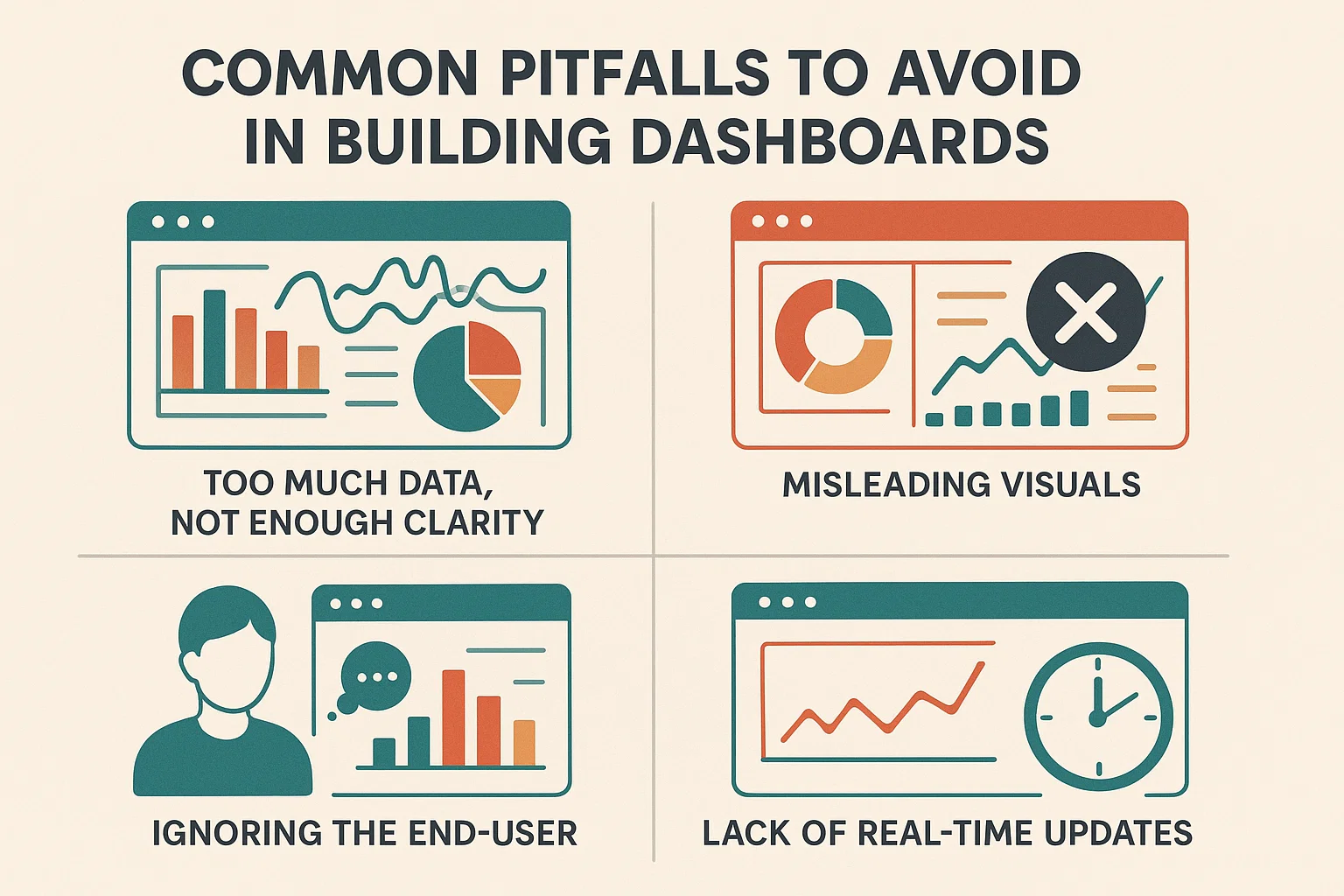
Common Pitfalls to Avoid in Building Better Dashboards
Even experienced users fall into these traps. Here’s what to watch out for:
❌ Too Much Data, Not Enough Clarity
Don’t overload your dashboard with every metric you can find. Focus on what matters.
❌ Misleading Visuals
Avoid pie charts with too many slices or axes that distort scale—these visuals confuse rather than clarify.
❌ Ignoring the End-User
If you’re building a dashboard for sales, but using operational metrics, it’s likely to be ignored. Always align with user intent.
❌ Lack of Real-Time Updates
Dashboards should reflect real-time or near-real-time data. Otherwise, users may act on outdated information.
Best Practices Summary Table
| Best Practice | Benefit |
|---|---|
| Define dashboard goals | Creates focused, purposeful layouts |
| Limit number of visuals | Enhances clarity and reduces cognitive load |
| Match visuals to data | Improves accuracy and insight |
| Use filters and drill-downs | Empowers users to explore independently |
| Align with user roles | Increases adoption and effectiveness |
Bonus Tip: Personal Dashboards
Dynamics 365 allows users to create personal dashboards tailored to their daily workflows. Encourage your team to build dashboards that serve their own unique needs—this increases ownership and productivity.
How Sky Soft Connection Can Help
At Sky Soft Connection, we specialize in building custom dashboards that do more than look good—they deliver results.
Our services include:
- Tailored dashboard creation for CRM and Power BI
- Data modeling and visual storytelling
- User training and dashboard adoption strategies
- Optimization of existing Dynamics 365 environments
With over 40,000+ hours of consulting and a 100% success rate on Upwork, our team helps organizations like yours turn data into decisions—fast.
Ready to build dashboards that drive performance, not confusion?
Contact us Now for Free Consultation
Conclusion
Building better dashboards in Dynamics 365 doesn’t have to be overwhelming. By defining your purpose, choosing the right visuals, and avoiding common pitfalls, you can create dashboards that truly inform and empower your team.
If you’re unsure where to start—or need help turning your dashboard vision into a reality—Sky Soft Connection is here to guide you every step of the way.
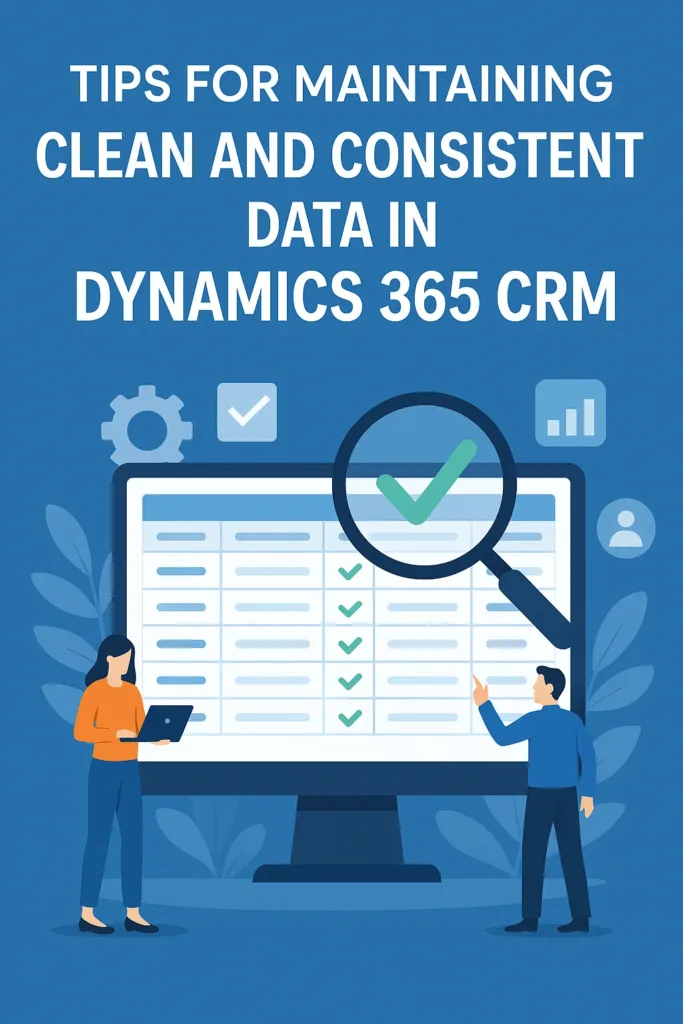
Read more : clean and consistent data in dynamics 365 crm expert tips
FAQ’s
A good dashboard is clear, user-focused, and uses relevant visuals to support decision-making without overwhelming the user.
Limit components, group data logically, and focus only on key metrics that align with user goals and business objectives.
Yes, Sky Soft Connection offers tailored dashboard creation and optimization for Dynamics 365 and Power BI users.
![]() is a software solution company that was established in 2016. Our quality services begin with experience and end with dedication. Our directors have more than 15 years of IT experience to handle various projects successfully. Our dedicated teams are available to help our clients streamline their business processes, enhance their customer support, automate their day-to-day tasks, and provide software solutions tailored to their specific needs. We are experts in Dynamics 365 and Power Platform services, whether you need Dynamics 365 implementation, customization, integration, data migration, training, or ongoing support.
is a software solution company that was established in 2016. Our quality services begin with experience and end with dedication. Our directors have more than 15 years of IT experience to handle various projects successfully. Our dedicated teams are available to help our clients streamline their business processes, enhance their customer support, automate their day-to-day tasks, and provide software solutions tailored to their specific needs. We are experts in Dynamics 365 and Power Platform services, whether you need Dynamics 365 implementation, customization, integration, data migration, training, or ongoing support.